Lettre
Chère Cristina,
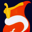
Je vous remercie pour ces images de chats toujours à la fois bien présents dans la composition de la toile – cependant j'ai remarqué qu'ils y occupent une présence très spéciale (1996) – par leur silhouette, leur volume, leur contour – (il y a un style spécial dans cette série) – ils choisissent une vie, un sorte de présence mouvante, (wandering over their limits) : leur énergie naturelle fait qu'ils excèdent un peu leurs proportions naturelles – beaucoup de sujets sont en liberté, « en évolution » « blooming or expanding over » over their limits, ils sont « en expansion », so to speak, ce qui est la marque de votre création très précisément cette année – là .
(Ça continue bien sûr, en-dessous, dans les années suivantes, à des degrés différents, ).
Vos plans, vos volumes de la vie courante, chats, fenêtres, vont se promener librement en suivant un contour, des frontières et des limites (comme masses) toujours poussés de l'intérieur par une rêverie – vous installez un style dans vos toiles avec une intention LIBEREE, disons, une liberté de « cut out », crossing and wandering over the normal size (c'est là que je trouve quelque chose d'un peu « matissien » dans la masse de vos sujets, dans cette série 1996-97) – la masse de vos volumes s'excède, s'épanche, DEBORDE d'une certaine façon lyrique – c'est une partie de votre inspiration mais cela (overflows, spills over?) et cela donne ces lignes qui mêlent, avec un effet de liberté qui ajoutant au rêve, une liberté formelle une inspiration vagabonde, a drive towards new limits, une poussée intérieure et un dépassement – dans la série de 1996, précisément, AVEC DES LIGNES LIBRES, GRACIEUSES, they seem reduced to the essence of a special graceful slim graphic style – (comme c'est difficile de dire ce que je veux exprimer!!!!) –
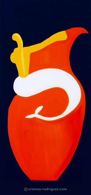
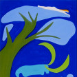
En 1996, la toile « Belonging to That Jar », just taking the one third of the upper part, is graphically extrêmement pure, légère, et en même temps, with quite simple means, elles occupe TOUT – elle triomphe avec le graphisme total d'une affiche – un grand poster pour un événement international – mais les moyens sont ultra simplifiés – it's stunning graphically. Pour moi (je souris) qui suis un peu « l'archélogue » de votre travail (pardon pour cette remarque humoristique), je retrouve la même grâce et la même ECONOMIE de moyens (of course, of course, of course!!!)
Dans le « To Mies van der Rohe » – avec une pureté de lignes (évidemment, avec un sujet comme celui-là!), mais là, vraiment, vous êtes très très FORTE – pour le « A Game Without a Name » , c'est exactement pareil, vraiment comparable à la simplicité immatérielle d'un pas de danseuse. Breathtaking.
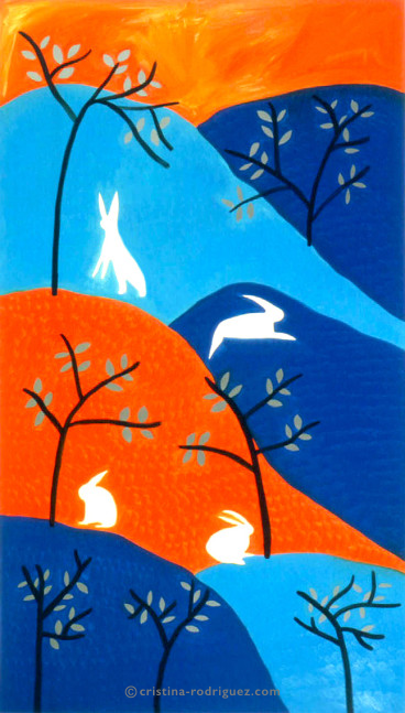
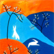
En 1997, « Characters With Long Ears » (joli titre) CONTINUE CETTE IMPRESSION DE LEGERETE – d'ailleurs, dans cette série de 1997, les « Tortoises », le « The Cuckoo in the Depths of the Woods » et sans doute aussi « The Garden of the Longhorns » ont des caractéristiques semblables. Il y a là une capacité d'abstraction et d'emprise (l'occupation de l'espace si on peut dire) par les volumes et la force de masse des éléments REDUITS – qui dégage une impression très spéciale.
Notez bien que « je ne veux surtout pas vous donner des conseils » (ce serait « sacrilège » comme vous dites) – mais il y a un lyrisme vaste de la ligne (le contour, l'enveloppe qui contient la masse d'un personnage, d'une fleur, d'une fenêtre, etc.) QUI CHERCHE SA LIBERTE SOUS NOS YEUX, dans un effort vivant – enfin, on peut être sensible à cela.
Cette fraîcheur, cet esprit naturel et impulsif-instinctif de votre expression artistique, un peu vagabond, » « libre en toute liberté » très inspiré, très « explorateur de l'espace » est une marque chez vous qui dit comment vous « allez à la conquête de la réalité imaginaire » – (il y a du Braque, il y a de la VISION, de la DIVINATION, des lignes un peu « existantes et floues » un peu matissiennes – pourquoi je pense ça ? – parce que les cut-outs de Matisse, ce n'est pas du dessin d'un autre genre – il DECOUPE DANS LA CHAIR DE LA COULEUR, IL A INVENTE UNE DELIMITATION DES ESPACES, 3PHYSIQUE ET « IMMATERIELLE » (guess what it is, god knows it !!) – (comme couper la peau d'une orange ! Une réalité concrète et physique et « de rêve » qui dépasse tout) (j'ai bien aimé quand vous avez parlé de DE Stael, – continents de couleurs – vous, au moins, vous comprenez tout!!!!) –
J'espère que je ne vous ennuie pas avec tous ces commentaires et que vous ne me taperez pas sur la tête, DE RAGE, parce que je fais des commentaires comme ceux-là sur votre style de peinture. Excusez-moi par avance. Je ne sais pas si je réussis à dire ce que je veux (???).
Eric Levergeois
Philosophe
2015
Letter
Translated by Dr. Ariane Galy (2024)
Dear Cristina,
Thank you for these cat images, always present in the composition of the canvas – however I have noted that they occupy a very special presence there – by their silhouette, their size and outline (there is a distinctive style in this series) – they choose a life, a sort of moving presence (wandering over their limits): their natural energy means that they exceed their natural proportions a little – many of the subjects are free, ‘evolving’, ‘blooming or expanding over their limits’ , they are expanding, so to speak, which is a characteristic of your creations from that year in particular (it of course continues, to varying degrees, in the following years).
Your designs and collections depicting everyday life, cats, windows, wander freely, following an outline, with frontiers and limits (as masses) always pushed out from the inside by some daydream – you install a style in your canvases with a LIBERATED intention, a freedom of, let’s say, ‘cut out’, crossing and wandering over the normal size (it is here that I find something a little Matissian in the mass of your subjects in this 1996-97 series). The mass of your sizing exceeds itself, spills out and OVERFLOWS in some lyrical way – it is a part of your inspiration and it creates these intertwining lines, emitting a sense freedom that only adds to the dream, a formal freedom, a roaming inspiration, a drive towards new limits, a push from the inside, overtaking – in particular in the 1996 series WITH FREE, GRACEFUL LINES, they seem reduced to the essence of a special graceful slim graphic style (how hard it is to express what I am trying to say!!)
In 1996, the canvas ‘Belonging to That Jar’, just taking the one third of the upper part, is graphically extremely pure, light and at the same time, with quite simple means, it occupies EVERYTHING – it triumphs with the total graphics of a poster – a large poster for an international event – but the methods are ultra simple. It’s stunning, graphically. For me (and I say this with smile), I am like an archaeologist of your work (please forgive this humorous remark), and I notice the same grace and economical use of methods (of course, of course, of course!!!) in ‘To Mies van der Rohe’, with its purity of lines (inevitably, with a subject matter like that), but really, there, you are very very GOOD – for ‘A Game Without a Name’, it’s exactly the same, very comparable to the intangible simplicity of a dancer’s step. Breathtaking. In 1997, ‘Characters With Long Ears’ (lovely title) CONTINUES THIS IMPRESSION OF LIGHTNESS – in fact, in the 1997 series, ‘Tortoises’, ‘The Cuckoo in the Depths of the Woods’ and without doubt also ‘The Garden of the Longhorns’ share similar characteristics.
There is here a capacity for abstraction and for taking hold (that is to say, occupying the space), by the volume and force of the masses of the REDUCED elements – which emits a very unique impression. Please note that ‘I absolutely do not want to give you advice’ (it would be a sacrilege, as you say) – but there is a vast lyricism to the line (its contour, the envelope that contains the mass of a character, a flower, of a window etc) THAT IS LOOKING FOR ITS FREEDOM UNDER OUR EYES with dynamic effort – anyway, we can be sensitive to this. This freshness, this natural impulsive-instinctive spirit of your artistic expression, is a little loose ‘free in total freedom’, very inspired, very ‘exploratory of the space’ – it is a characteristic of yours that tells us how you are going to ‘conquer the imaginary reality’ (there is some Braque, there is VISION, DIVINATION, lines that are a bit ‘blurred’, a little Matissian. Why do I think this? Because Matisse’s cut-outs are not just another type of drawing – HE CUTS INTO THE FLESH OF THE COLOUR, HE INVENTS A DELIMITATION OF SPACE, BOTH PHYSICAL AND ‘INTANGIBLE’ (guess what it is, god knows it!!). Like cutting the skin of an orange!
A concrete and physical reality as well as a dreamed reality that transcends everything (I liked it when you spoke about De Stael – continents of colours – you, at least, you understand everything!!!!). I hope that I am not boring you with all these comments and that you won’t hit me on the head in a RAGE because I make comments like these on your painting style. Forgive me in advance. I don’t know if I am managing to say what I want (???).
Eric Levergeois
Philosopher
2015